

Small Lettering Digitizing Service
Small letters. No room to hide.
Small embroidered text needs the right spacing, stitch structure and density to keep counters open and letterforms readable.
- Small-text optimization
- Readable stitch planning
- Major machine formats
- 01 Original type
- 02 Embroidery interpretation
- 03 Stitch structure · magnified
01–03 sample word · illustration
Why small text is different
At small size,
every stitch shows.
Small lettering is where most embroidery files fail first. We digitize each letter for its real sewn height, so counters stay open and strokes stay sharp.
Text that looks crisp on screen can sew as a blur. Thread has physical width, so when letters get small the gaps inside an "e" or "a" close up and neighboring letters run together.
Shrinking a font does not make small embroidery. Auto-generated lettering at small sizes usually keeps full density and full underlay, which packs too much thread into too little space. The stitch structure has to change, not just the size.
Screen type
- Fine strokesThin serifs and strokes break up or disappear
- Tight spacingWords merge into one shape at a distance
- Tiny countersLetters like e, a and s fill in completely
- Sharp cornersPoints that pile into small knots of thread
- Perfect vector edgesEdges thread cannot follow at that size
Stitch-ready type
- Open countersHoles sized to survive thread spread
- Controlled spacingOpened slightly so letters stay distinct
- Viable stroke structureSatin where it forms, run stitch where it cannot
- Balanced densityMore open than large lettering
- Clean stitch directionAngles that separate neighboring letters
Anatomy of readable embroidered type
Adjustments that keep small text legible.
Below a certain height, every lettering setting needs to be reconsidered. Select a part of the sample word to see what changes.
-
Counters need enough space to survive thread spread and fabric movement. Small satins are sewn more open than large ones; thread fills the gap naturally at that scale, and the extra room keeps counters from closing.
-
Letter strokes may need embroidery-specific adjustment: too thin and they break up, too heavy and they swallow the counters. Satin columns need enough width to form; when strokes get too narrow, we switch to a double or triple run stitch so the letter still reads instead of collapsing.
-
Spacing that works in print may need to open slightly once each character becomes stitched thread. Problem pairs are adjusted individually so words stay distinct when viewed at arm's length.
-
If the fabric shifts while a word sews, letters can drift up or down. Light underlay, a sensible sewing order and the right stabilization in production help the letters land on one clean baseline.
-
At tiny sizes, sharp corners pile stitches into small knots. A single center-run underlay is usually enough; edge-run or zigzag underlay on tiny letters adds bulk that rounds off corners, so corners are turned rather than stacked.
-
Satin crosses each stroke. The angle affects the letter's shape, how well it covers, how it catches the light and how cleanly neighboring letters separate.
Before and after
When small text fails.
The same word, three ways. The bad conversion is what scaling a large file down, or auto-converting, typically produces.
-
01 · Artwork
- Perfect digital type
- Thin strokes, tight spacing
-
02 · Bad conversion
- Closed counters
- Crowded letters
- Heavy strokes
- Uneven edges
-
03 · Optimized file
- Open counters
- Clear spacing
- Controlled density
- A readable result
Illustration Shown enlarged so the difference is visible.
Counters
Keep the holes open.
As embroidery gets smaller, the open spaces inside and between letters become as important as the thread itself.
Illustration Highlighted areas are the counters.
Font style
Font style matters.
Some styles tolerate small embroidery better than others. None is automatically good or bad; size and fabric decide.
-
Simple sans
Even stroke widths and open shapes make these the safest choice for small sizes.
-
Serif
Fine serifs and hairline strokes are thinner than thread can render, so they are thickened slightly or simplified.
-
Script
Joins and thin connecting strokes need extra care; script may need more adjustment depending on size and fabric.
-
Condensed
Narrow letters leave little room for counters; spacing and weight often need opening.
-
Bold display
Heavy weights read well but can close their counters, so density is kept in check.
Illustration Each card shows the style large and small.
Size
How small can it go?
It depends on the font, thread, fabric, machine setup and the amount of detail inside each character. There is no single number.
- Font and weight
- Thread weight (40wt or 60wt)
- Fabric surface
- Machine setup
- Detail inside each character
Surface
The same letters.
Different surface.
Small text can behave differently because stitches sink, spread or move differently on each fabric.
Piqué / textured knit
Textured polos swallow small stitches. A light topping or a slightly bolder letter helps text sit on top of the knit.
Smooth woven
Dress shirts and twill give tiny text the best chance and support the finest lettering we typically recommend.
Fleece / soft surface
Pile can bury thin strokes, so lettering often needs more weight or a little more size.
Illustration The full fabric story for chest logos is on the left chest page. Left chest digitizing
Small lettering on caps
Small text on a curved, crowded panel.
Side and back cap text is often the smallest lettering on an order, and it sits on a surface that moves.
- Curved surfaceLetters can drift on a panel that bends under the needle.
- Limited areaSide and back placements leave very little room.
- Cap constructionSeams and stiff fronts affect where text can sit.
- Small textEverything on this page applies, with less margin for error.
Before we digitize
Five things we ask. "Not sure" is fine.
- 01
Exact text
What must be embroidered, exactly as it should read, including capitals and punctuation.
- 02
Finished size
How wide and tall the lettering will be when sewn. Small text is built at its final size, not scaled from a master.
- 03
Application
Cap, polo, uniform, patch or something else.
- 04
Fabric
If you know it. Textured knits, smooth wovens and fleece each change the plan.
- 05
Font or brand style
Any typeface or brand rule that must stay. We digitize from your font or artwork, then adjust weight and spacing where needed. Tell us if you run 60wt thread.
Service snapshot
Small Lettering at a glance
- Best for
- Names, taglines, small wordmarks and monograms
- Main challenges
- Counters, spacing, stroke width and density
- Applications
- Polos, caps, uniforms and patches
- Stitch type
- Satin, or run stitch for very thin strokes
- Underlay
- Center-run, kept minimal
- Fine thread
- Can be planned for finer thread; setup depends on your machine and fabric
- Formats
- DST, PES, EXP, JEF and other supported formats
- Artwork
- Vector preferred; clear raster accepted
- Turnaround
- Confirmed with your quote
Formats you can request
Machine formats
- DSTTajima
- PESBrother / Baby Lock
- JEFJanome
- EXPMelco / Bernina
- VP3Husqvarna / Pfaff
- XXXSinger
- HUSHusqvarna
- EMBEditable working file (ask first)
A standard order includes one machine format of your choice. Additional formats, and the editable EMB working file, are not automatic: we confirm availability and any charge with your quote.
Not sure which format? Small text is sensitive to scaling, so the file is built at its final size. Tell us your machine format and we will deliver it at that size rather than a generic master. We'll recommend the correct file for your machine.
Converting a file you already haveHow orders run
How lettering orders run.
-
01
Upload
Upload artwork or text
Share the wording, font and the thread weight you sew with.
-
02
Size
Tell us final size and application
We tell you upfront if the text is at a size that will be hard to read, and suggest a workable size, weight or font.
-
03
Optimize
We optimize the lettering structure
Density, underlay, stitch type and spacing are set letter by letter for the actual sewn size.
-
04
Deliver
Receive the machine-ready file
Receive the machine file and a color and stitch sheet, with a note of the thread weight the file was planned for.
Related samples
Read the stitches.
-
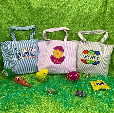
Monogram · Lettering
Easter tote names Westin, Eli, and Wyatt
- Placement
- Monogram
Have a design like this? Send it with the size and placement for a free quote.
Get Free Quote -
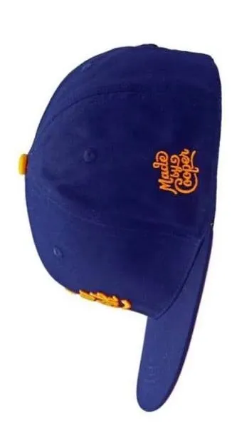
Caps
Made Cooper side lettering
- Placement
- Cap front
Have a design like this? Send it with the size and placement for a free quote.
Get Free Quote -
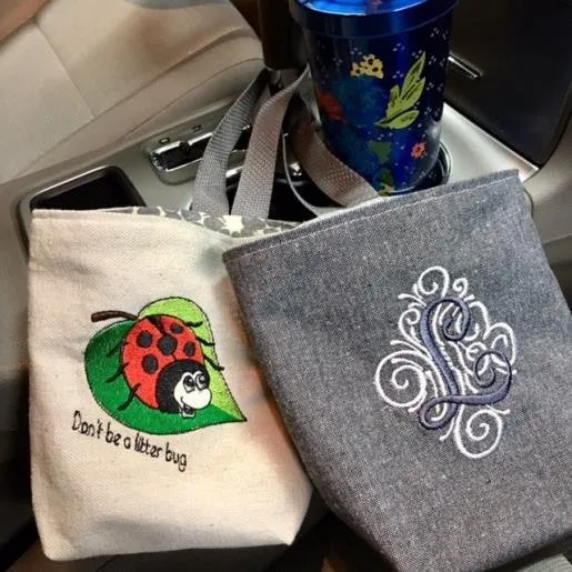
Monogram · Lettering
Ladybug tote and script LS bag
- Placement
- Monogram
Have a design like this? Send it with the size and placement for a free quote.
Get Free Quote
Small text to digitize?
Send the lettering.
Tell us how small it needs to sew.
We'll review the type, size and application before building the stitch plan.
Questions
Small lettering questions.
What people ask before sending small text. Anything else, ask with your quote.
All questions01What is small lettering digitizing?
Building embroidery files for small text, such as names, taglines and small wordmarks, so each letter keeps open counters, clear spacing and a stroke structure that holds at its real sewn size.
02How small can embroidery lettering be?
There is no single number, and very small text cannot always be promised to sew clearly. It depends on the font, the thread weight, the fabric, the machine setup and how much detail is inside each character. As reference points, thread maker Madeira reports about 6 to 7 mm as the smallest clear text with standard 40-weight thread and about 3 mm with its 60-weight thread, while other thread makers put 60-weight nearer 4 to 5 mm. These limits usually refer to capital letters; lowercase letters are only about 70% as tall. We check your text at its size and tell you what will read before we build the file.
03When is it better to enlarge or simplify the text?
When the text is below the size its font is designed to sew at, when it uses a thin script or detailed serif, or when it sits on a textured fabric such as piqué, fleece or terry. Usually the better result comes from making the text a little larger, switching to a simpler sans-serif, sewing it in a finer 60-weight thread with a smaller needle, or leaving a tiny tagline out of a small logo. Below roughly 5 mm, a single-run style can stay more readable than a satin column that has become too narrow. If the text is part of a logo, logo digitizing covers how the whole mark is adapted.
04Why do small letters close up?
Thread has physical width. When letters get small, the gaps inside an "e" or "a" close up and neighboring letters run together, especially if the file keeps full density and full underlay. Narrow strokes are also the most affected by pull compensation. Our guide to small embroidery lettering problems compares the size guidance different sources publish.
05Does the fabric change how small text sews?
Yes. On piqué, fleece, terry and other textured fabrics, small letters can sink into the surface. Thread and stabilizer makers recommend a water-soluble topping on top of the fabric to keep the stitches up, and on polos a light, tone-on-tone base under the lettering can give it a smoother surface. A test sew-out on the same fabric is the most reliable check before a production run.
06Can you embroider serif fonts at small sizes?
Often, with adjustment. Serifs and thin strokes are often narrower than a single thread, so we slightly thicken or simplify them so the font keeps its character without breaking up.
07Can script lettering be digitized small?
Sometimes. Thin joins and connecting strokes need extra care, so script usually needs more adjustment, or a little more size, than a simple sans at the same height.
08Why does spacing change for embroidery?
Each letter becomes stitched thread that spreads slightly, so spacing that works in print can close up. Letters are spaced slightly wider than in print, and problem pairs are adjusted individually.
09Can small cap lettering use the same file as shirt lettering?
Usually not. Cap side and back text sits on a curved panel with little room, so it is built as its own file. See cap digitizing.
010What artwork should I send?
The exact wording, the font or a vector file if you have one, and the finished size. A clear PNG or JPG is fine for review.
011Which machine formats do you provide?
DST, PES, EXP, JEF and others. Small text is built at its final size, so tell us the format and the size.
012Can you fix a lettering file that is too dense or unreadable?
Usually. Scaling a file down keeps the stitch count while shrinking the area, so density rises and letters fill in. Small text should be re-digitized at its final size; send the file and a photo and we tell you what we would do.
013Can you digitize names and personalized text?
Yes. Names are built at their sewn size with the same care for counters and spacing. If you need many names in one style, tell us so the set stays consistent. For staff names and credentials on scrubs and lab coats, see healthcare and medical.
014How is small lettering digitizing priced?
Each design is quoted before any work starts. The quote depends on how much text there is, how small it has to sew, the font, and whether it sits inside a larger logo or design. Separate versions for different fabrics or thread weights are quoted with it. See pricing and policies.
Related services
Built for a specific job.
-
 Left Chest Digitizing
Small-format files tuned for polos, piqué and knits, with lettering that stays sharp at chest size.
- Illustration Logo Digitizing Brand marks simplified for thread and built as size-specific versions that sew the same every time.
-
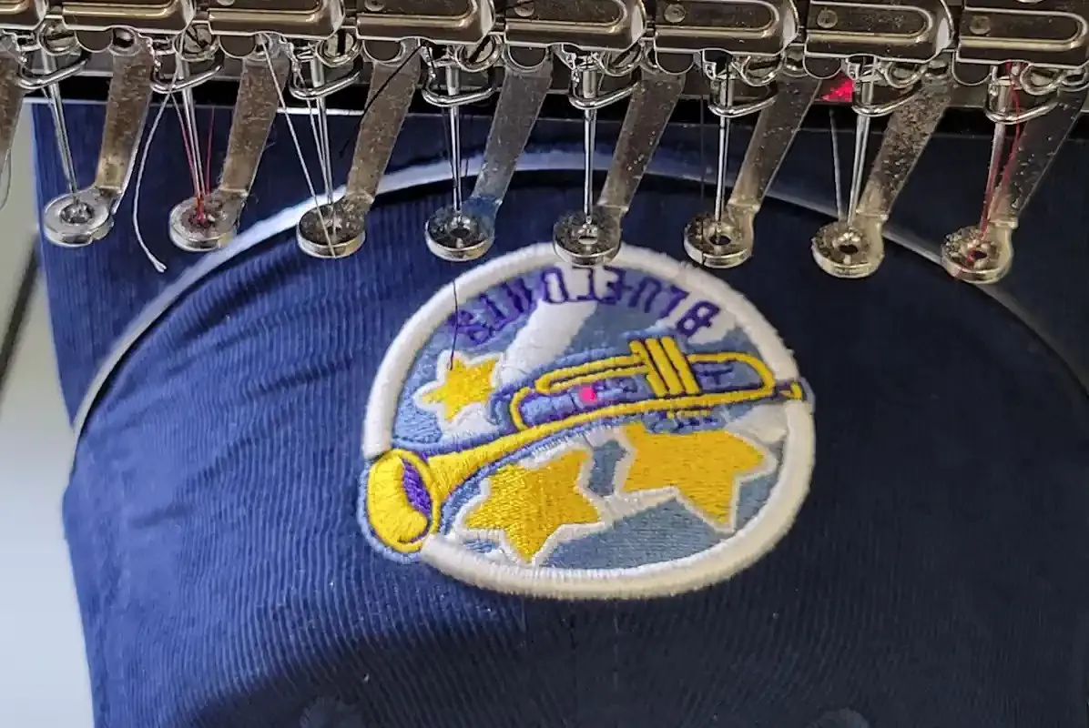 Cap & Hat Digitizing
Center-out sequencing and curved-surface compensation built specifically for headwear.
-
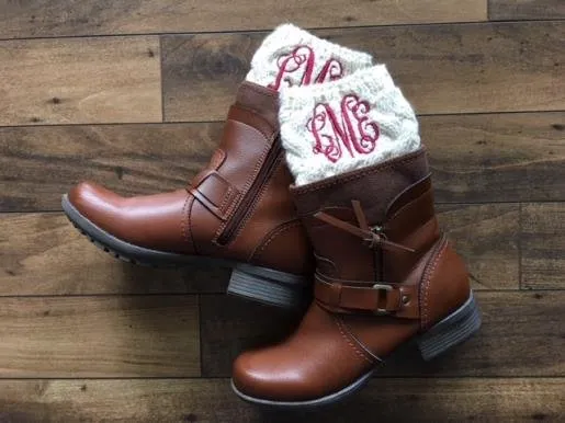 Monogram Digitizing
Diamond, circle and stacked monograms with interlocking letters layered to sew cleanly.
Free quote · No payment to ask
Small type.
Clean read.
Upload the design, tell us where it needs to sew, and we'll take it from there.